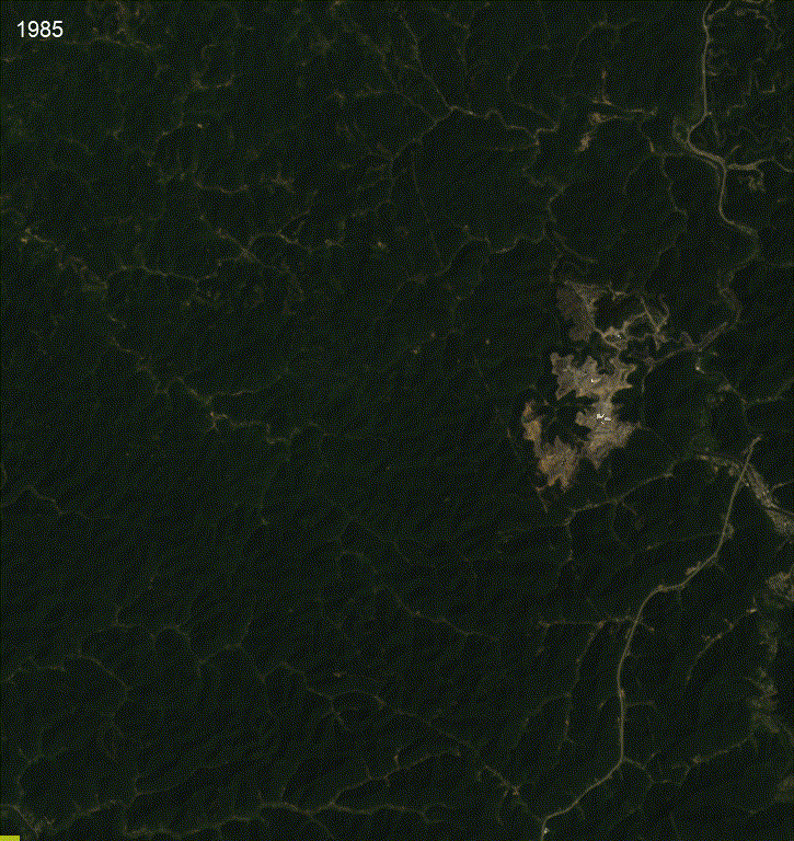
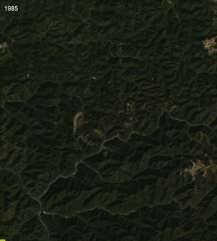
Satellite Timelapse of Mining
Timelapses showing the 40-year landscape changes from two mines in West Virginia, shared on SkyTruth’s website and social media posts.
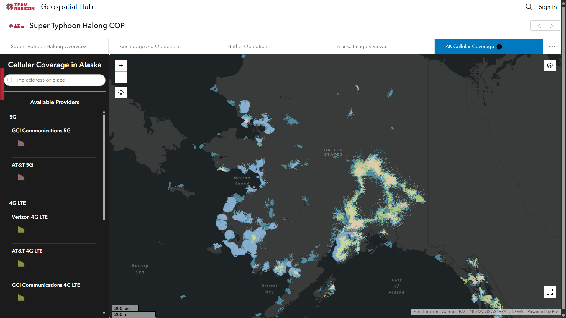
Typhoon Halong
With Team Rubicon, I created this dashboard showing cell coverage in Alaska, as part of a larger ArcGIS Hub site, to support planning and field coordination during the response to Typhoon Halong in Alaska.
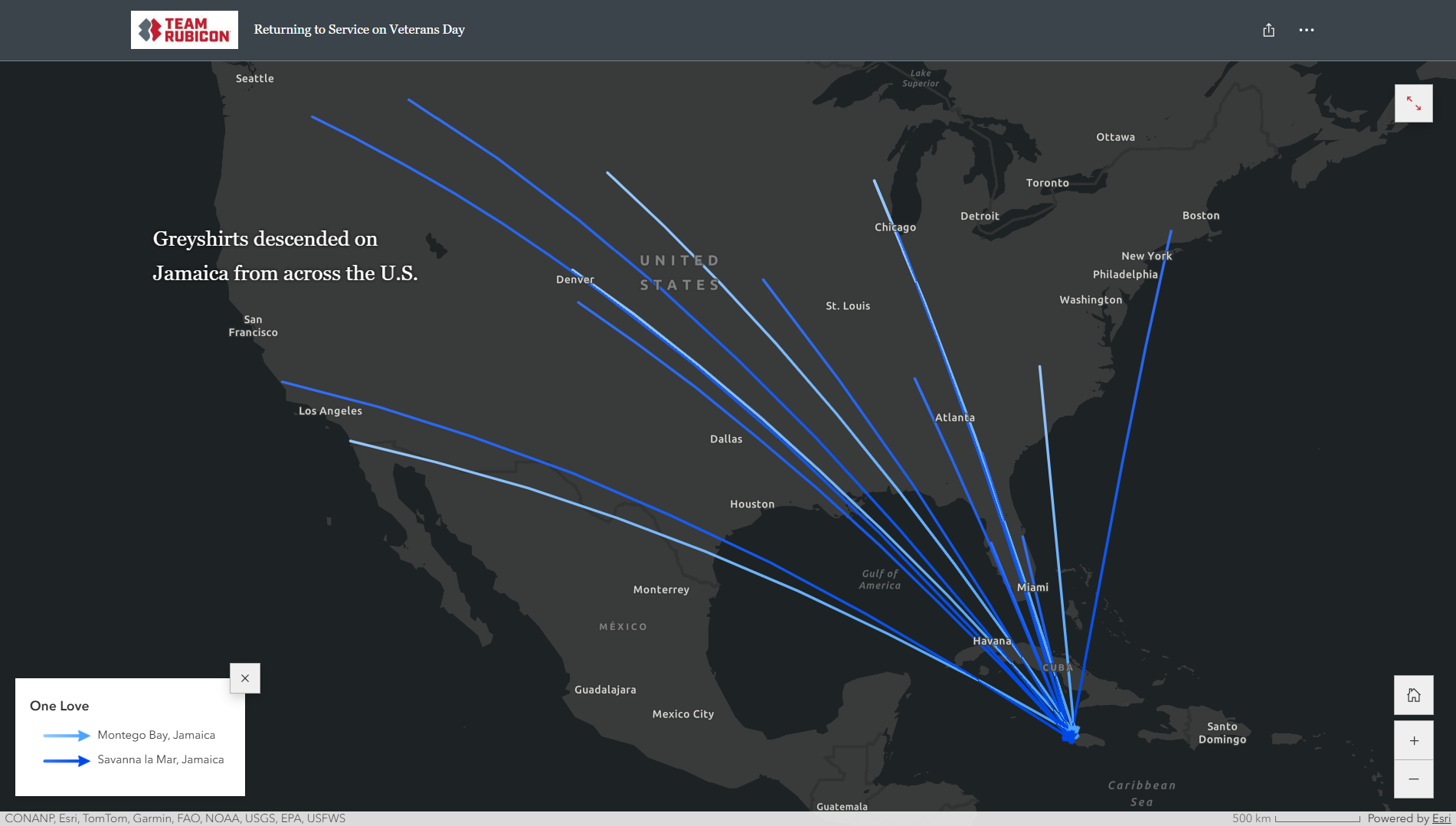
Hurricane Melissa
With Team Rubicon, I created maps for this published story map showing where Team Rubicon volunteers traveled to support disaster response in impacted regions.
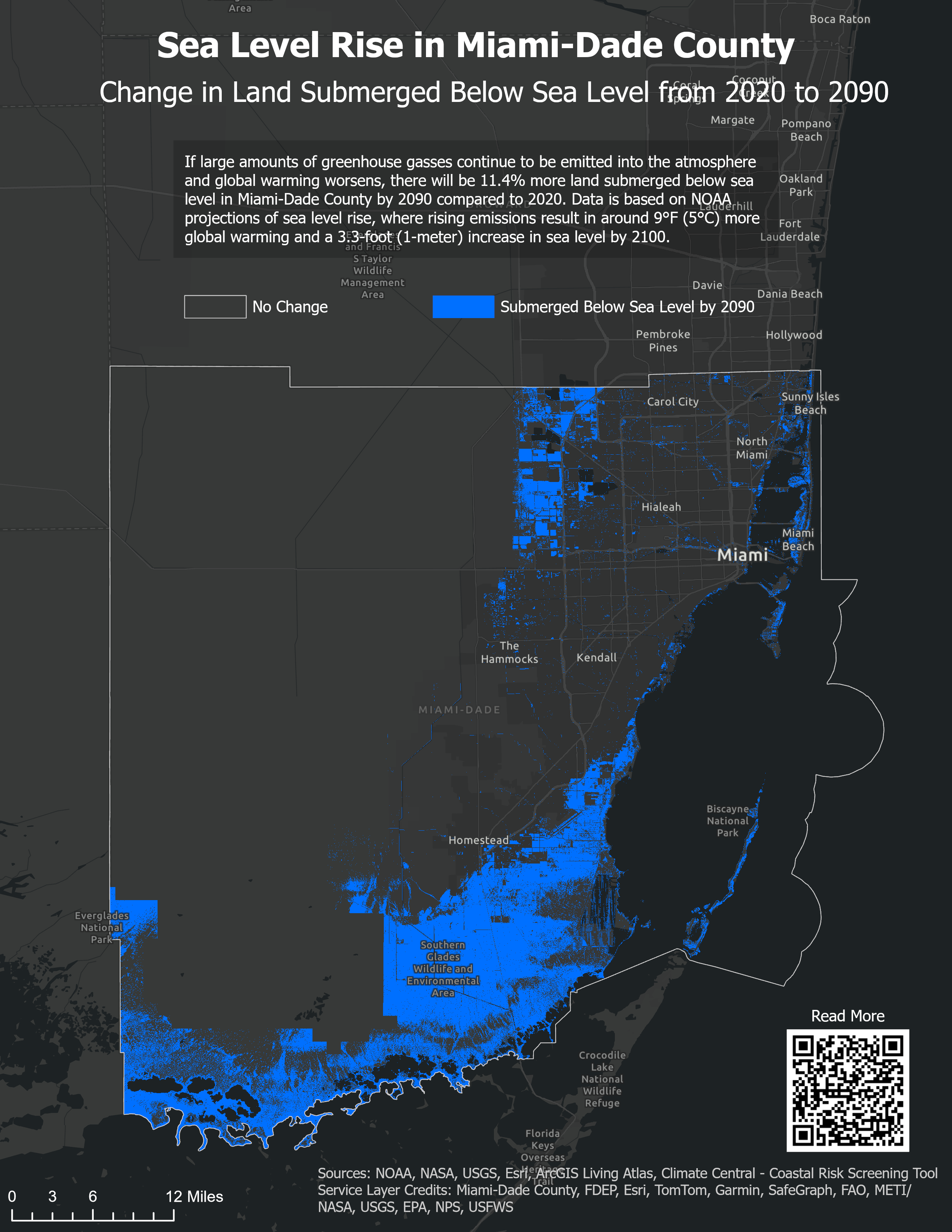
Sea Level Rise
Sea level rise in Miami-Dade County using NOAA data, visualized using ArcGIS Pro.
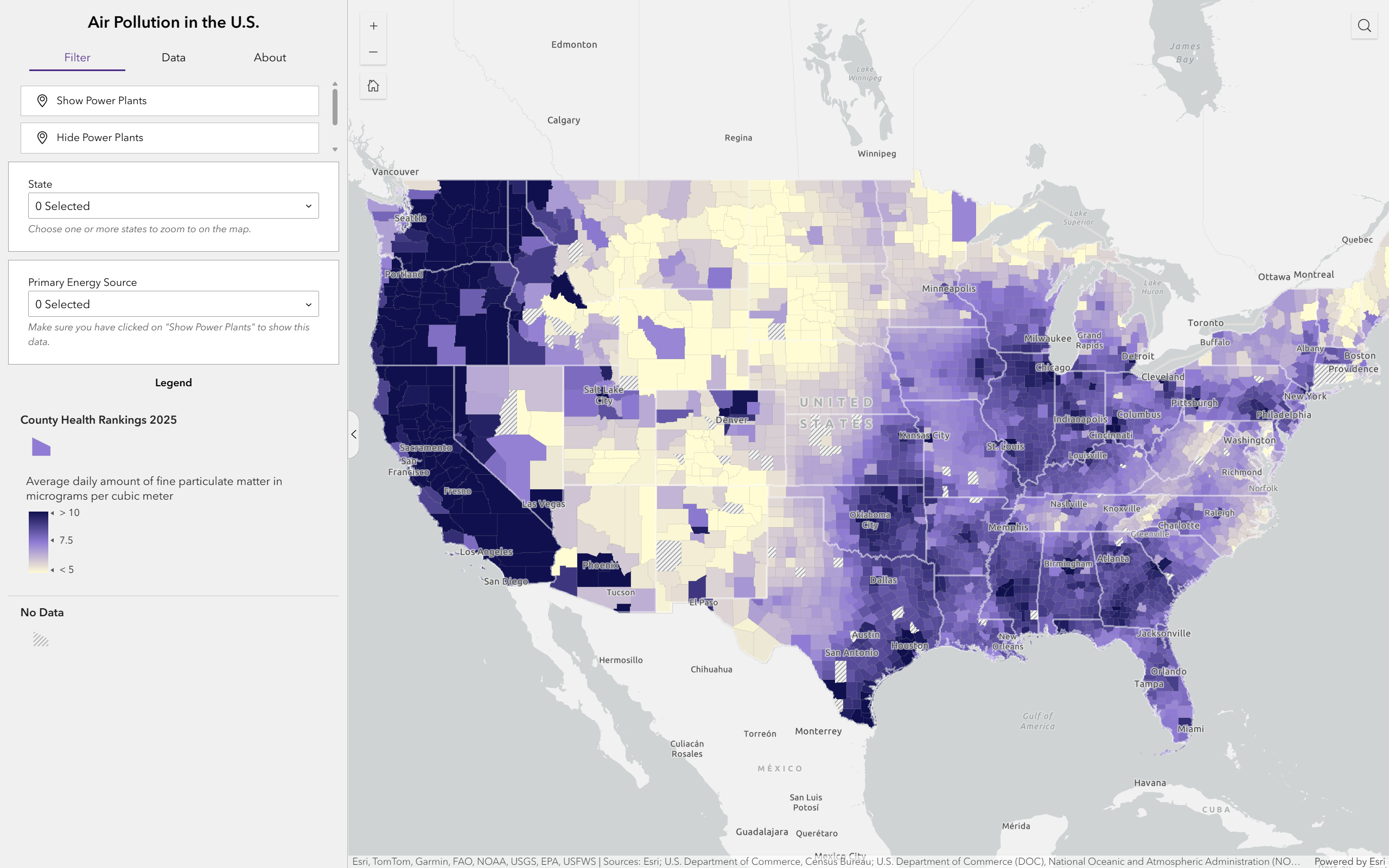
Air Pollution
This dashboard visualizes county-level particulate matter data across the U.S., made in collaboration with another student.
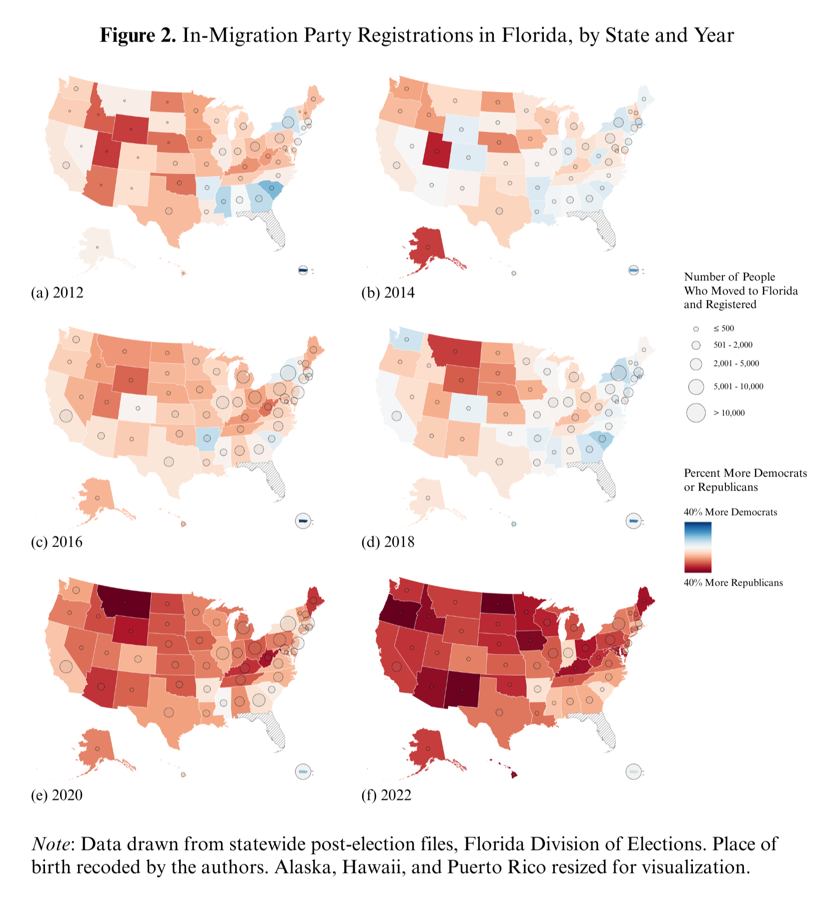
Geographic Mobility Map
This series of maps from 2012 to 2022 visualizes how the political party affiliation of voters who moved to Florida from other states changed over the years. I wrote a script to clean voter file data for multiple years, aggregated statistics by state with R, and created the maps with ArcGIS Pro. This map is published in a paper in the Political Science Quarterly: McKee et al., 2025.
Over the Years
Reflecting on my background living in South Florida and my passion for geography and data, I created Over the Years, a digital artwork featuring a timelapse of flooding from sea level rise and a graph of changing sea levels over time. As part of the Climate Storytelling 2075 Anthology, this artwork was exhibited in fall 2025 at the Queens Council on the Arts in partnership with Ofrenda Fest in Queens, New York.
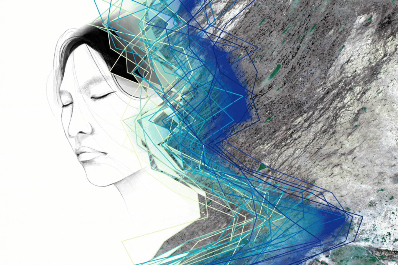
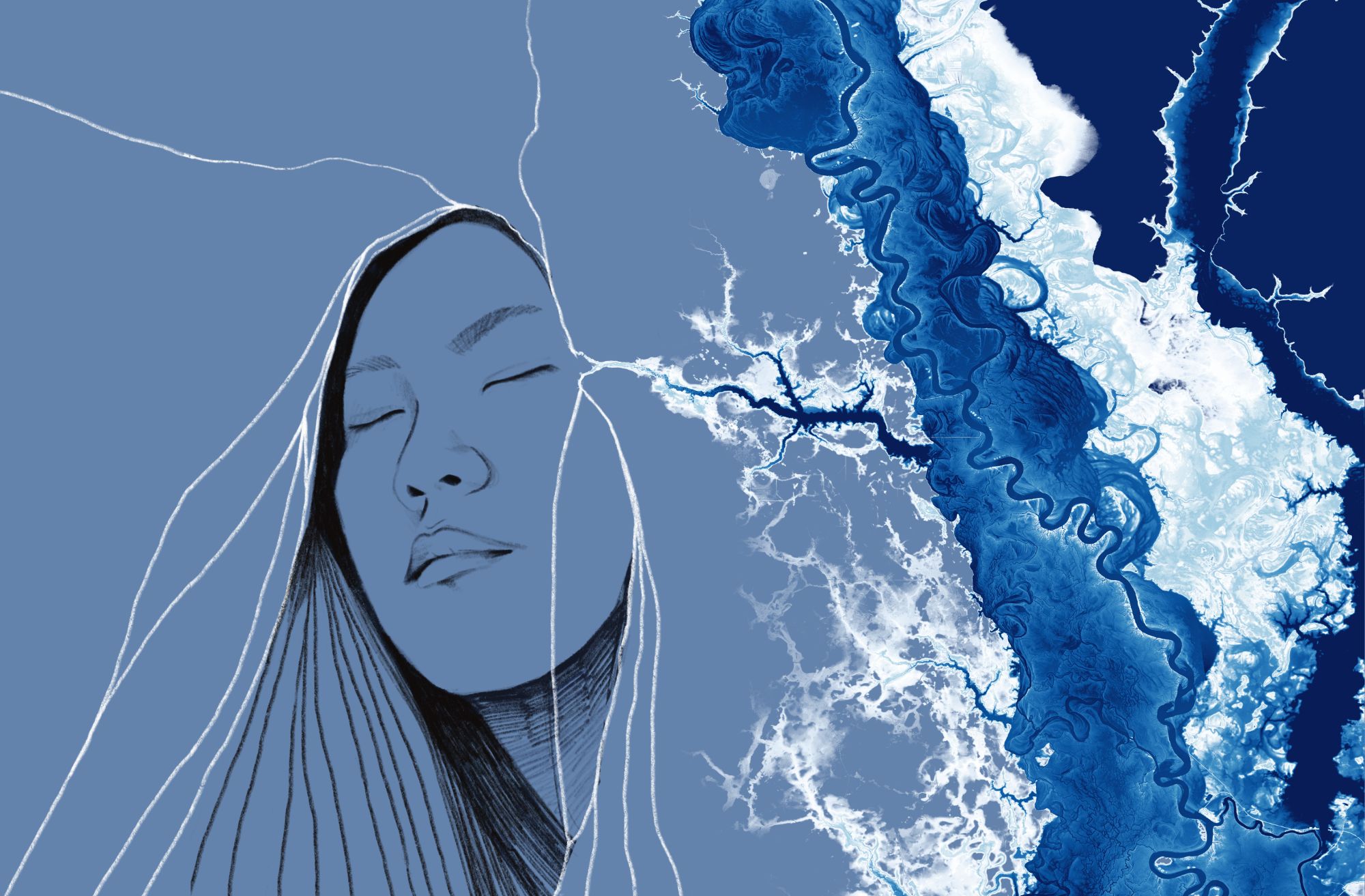
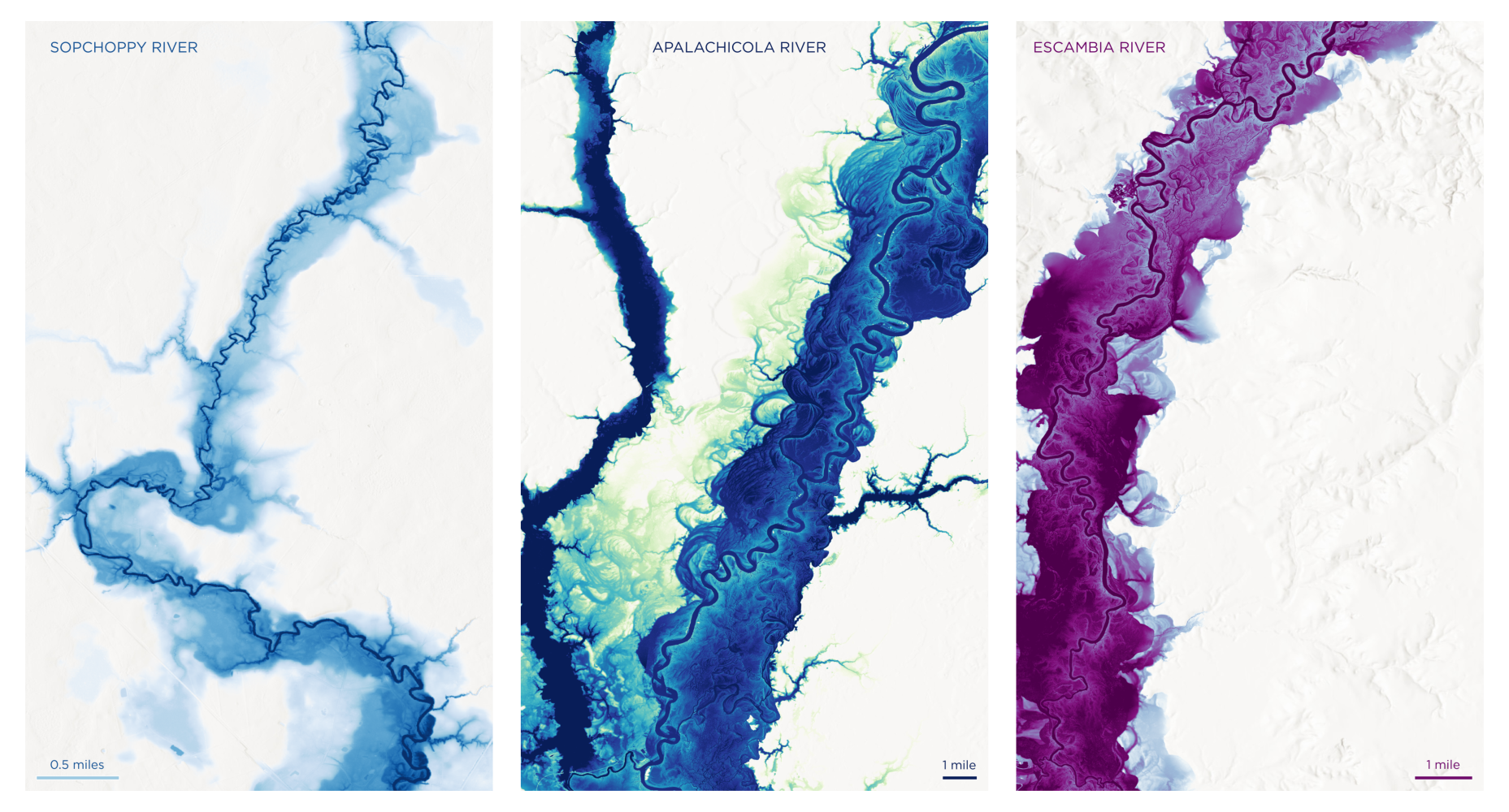
Coalescence
The artwork, titled “Coalescence” (the process of coming together to form a larger whole), includes a self portrait paired with a visualization of Apalachicola River in Florida, with data from the NOAA Office for Coastal Management. This artwork was featured in the Chengyu for Change zine with a workshop about environmental futures hosted at the Miami Beach Regional Library.