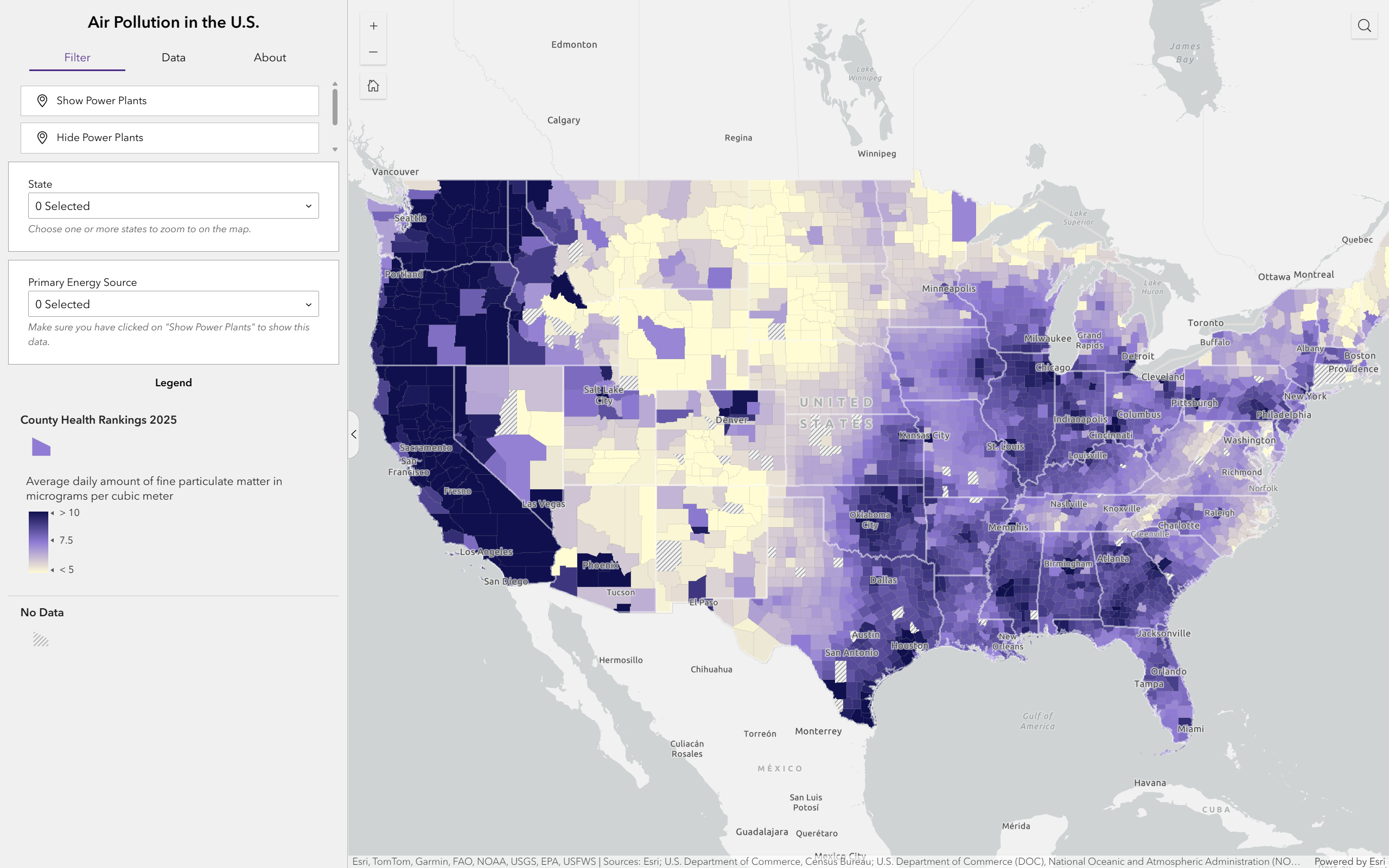
Air Pollution
This dashboard visualizes county-level particulate matter data across the U.S., made in collaboration with another student.
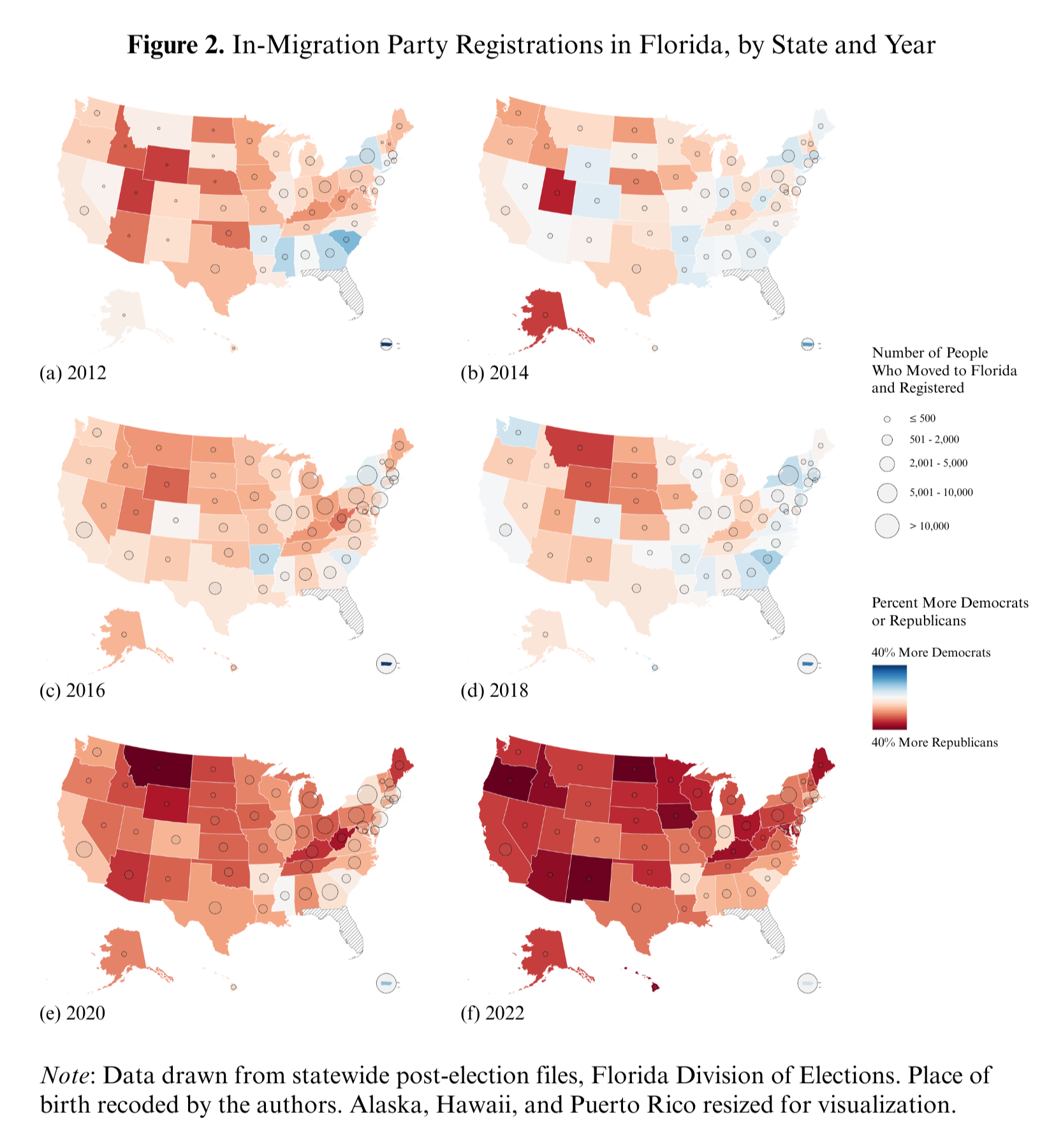
Geographic Mobility Map
This series of maps from 2012 to 2022 visualizes how the political party affiliation of voters who moved to Florida from other states changed over the years. I wrote a script to clean voter file data for multiple years, aggregated statistics by state with R, and created the maps with ArcGIS Pro. This map is published in a paper in the Political Science Quarterly: McKee et al., 2025.